Lead User Bell Curve Diagram vs. "Crossing the Chasm" Bell Curve Diagram
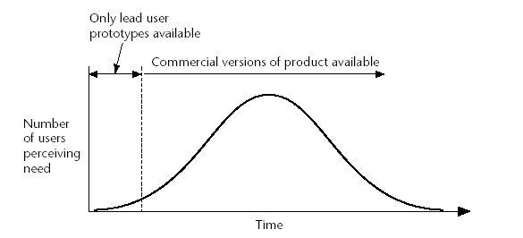 Figure 1. Eric von Hippel's Lead User Bell Curve Diagram (Democratizing Innovation, pg. 134)
 Figure 2. Geoffrey Moore's "Crossing the Chasm" Bell Curve Diagram (Wikipedia)
Both authors describe a bell curve. The x-axis is the same in both diagrams; it represents time. The y-axis, however, represents different things.
For Moore, the y-axis is the number of people who adopt an innovation in a given period of time (x-axis). For von Hippel, the y-axis is the number of people who begin to experience the need for an innovation in a given period of time (x-axis).
The curves are not necessarily correlated in time. Say an innovation to address the need is never invented. In that case von Hippel’s graph might show a bell-shaped curve but Moore’s graph would show a flat line, y=0.
Conversely, in a particular span of time, von Hippel’s curve may be flat while Moore’s graph shows a bell-shaped curve if a solution appears suddenly on the market to a long-standing unaddressed need. Even though the trend toward increasing need has already played out and everyone who wants a solution can obtain it, the diffusion will still be gradual and probably conform to a bell-shaped curve. This is because—as Moore argues—the mainstream of the market will refuse to adopt the solution until it is well proven by the early-adopters.
A question still remains in my mind about the difference between Lead Users and Technology Enthusiasts / Visionaries.
For another good post on this topic, see Adina Levin's weblog entry on Lead Users vs. "Crossing the Chasm".
posted by Michael Osofsky at
9:45 PM
6 Comments
![]()
![]()